The Design of Dungeons & Dragons
October 5, 2010When D&D 4th Edition came out in 2008, I was so pleased with the new rulebooks that I decided to write up the design of the various editions. Well, I ended up being too busy to do that. But upon seeing one of the even more impressive D&D Essentials books, I had to revive that project. Get ready for some intense nerdery.
1978: First Edition
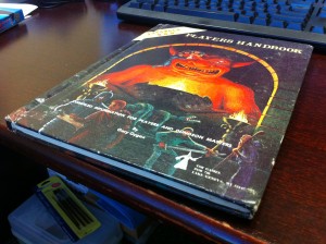
Well, this edition was clearly designed by hobbyists for hobbyists. It’s hard to complain about design in a project put together by just a few geeks excited to share their cool new game. But I’ll try.
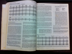
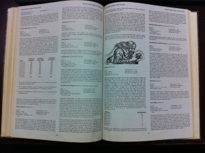
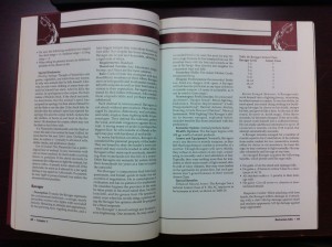
The big, thin, hardcover format used for these early books set the standard for pretty much all RPG books for the next thirty years. Maybe it appealed to the data-happy, statistics-oriented gamers of the day. The result is really big pages fulla lots and lots of information at once.
Super wide columns with minimal margins make pretty much all paragraphs significantly wider than they are tall, emphasized by the line between paragraphs. The tightly-leaded Futura, a typeface not very well suited to big blocks of text, make for a pretty dang unreadable document!
Futura, of course, has an oblique variant rather than a proper italic, so special terms are hard to pick out from the text around them. Headings are just bold Futura at the same size as the text, either all-capped or not.
So, yeah, all around a pretty difficult set of books to navigate and read. Of course, D&D was so novel and cool at the time, and the challenge of understanding the rules was probably part of the fun. Nerds of this sort don’t need to make their materials accessible to common folk!
1989: Second Edition
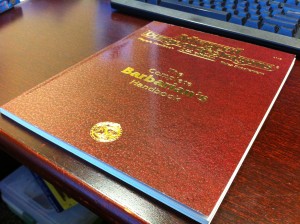
This era is dear to my heart; my brother-in-law introduced me to D&D when I was 10, and these were the books I spent hour after hour studying (without ever successfully running a campaign). Unfortunately I don’t have access to any core books from this edition, so I used a supplement that I found in the office library.
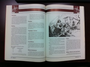
Yayy, Palatino! A lovely typeface designed for pages of text. Maybe it’s the sentimental value, but I have always loved the no-nonsense, clear design of this edition. The reading is spacious. There’s a single subtle color for headings (in the core books they were blue). (@sben reminds me that this typeface is Friz Quadrata. I hunted this one down a while back when I saw it in the Durarara!! credits and couldn’t remember where I’d seen it — turns out it was from World of Warcraft.) There’s just one level of heading, and subsections preceded by bold titles with colons. There are very few different styles of lists and tables. A little bit of flavor and color at the top, and the rest of the adventure is left to your imagination.
1995: 2nd Edition Revised
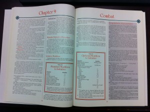
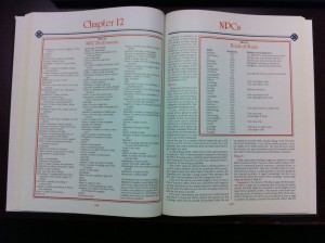
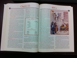
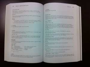
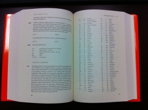
Holy good goshes do I dislike these books. If I had discovered D&D just a few years later, it’s unlikely I would have such fond memories of paging idly through the rulebooks time after time, imagining the worlds I could create. This edition feels so alien, so unwelcoming.
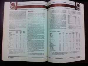
I have to start with the heading font. It’s so flagrantly idiosyncratic, so unreadable, so frequently used, and _so… red. _Except when it’s purple sometimes. It gives the entire page a too-unique flavor, one that’s just not quite right for this game. I could imagine some D&D campaign where that font would be at home, but it just isn’t appropriate in the core rulebooks for the whole game. (@sben informs me that this typeface is University Roman, also used by the Carson-era Tonight Show!)
The main text is not much better. It’s all in a not-too-attractive sans-serif that just isn’t comfortable to read. Big big swaths of text are presented in its oblique variant, which is even harder to read, without being different enough to usefully differentiate important terms.
Then the boxes. Oh the double-bordered black and bright-red boxes. The boxes next to separator lines next to boxes inside boxes. The boxes pushing partially into columns of text. The boxes encompassing whole pages. The too-dark “optional rule” boxes that go on and on. This layout already doesn’t afford nearly enough white space, and the claustrophobic boxes make it worse. There are so many dang ugly boxes.
Bleaurgh, I don’t like anything about these books!
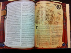
2000: 3rd Edition
3rd Edition is where the production values and branding went way up, while the readability really didn’t. These books were cool to pick up off the bookstore shelf or your friend’s dresser and flip through. But trying to use them to play a game is a different story.
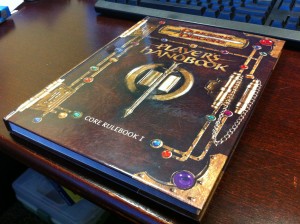
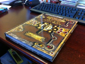
I do quite like the faux-3D covers, actually photographs of sculptures by Henry Higginbotham. They were something new, something unique, and something universal that suggested adventure without pushing too far in any particular direction. That’s actually pretty important to me — the simpler, more anonymous illustrations and paintings (especially around the 2nd Edition era) set my imagination going rather than trying to document precisely what a certain monster or character looked like.
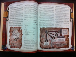
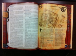
Sadly, the hyper-cool approach to the cover design was continued inside the books. Cheesy year-2000 CG metal effects frame every page. Diagrams are wrapped in distressed parchment boxes. And every single line of text is defaced with intermittent sketchy brown underlines. This stuff is frankly an insult to the person who’s already paid for the book and is trying to make use of it.
Probably the worst thing in these books was the way that the first page of each chapter was especially distressed. It might have been cool if all that page held was a chapter intro. But actual content — spell details, stats, rules, tables — started right on that page. So, for example, of all the spells in the entire book, the 0- and 1st-level bard spell lists get this totally different and totally unreadable treatment. So many times our group couldn’t find what we were looking for because it was on the page that doesn’t look like normal chapter content.
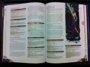
2003: v3.5
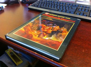
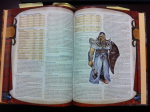
The 3.5 update didn’t change the design much at all. The covers were prettied up, the brown underlines may have been toned down a bit, and the tables gained some alternating row coloring. This is the edition I used to finally start my first successful campaign. As you can see from the Post-It notes sticking out of the book, it was difficult to keep track of where stuff was, and the difficulty of certain rules (grappling!) made it necessary to look stuff up every time.
This era of D&D reminds me of my favorite Robert Bringhurst quotation — one of my favorite quotations from anyone, really:
The script of Macbeth does not need to be bloodstained and spattered with tears; it needs to be legible.
2008: 4th Edition
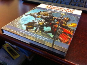
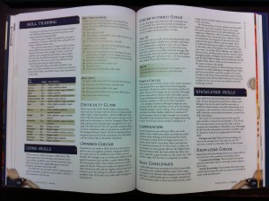
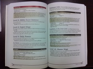
Here’s a design I can really get behind. Moving our gaming group over to 4th Edition was a pleasure. The game was redesigned to be friendly to players, and less demanding of Dungeon Masters. The materials were carefully and maturely designed. I am just as happy to spend gobs of time inside these books as I was with the 2nd Edition.
Something about the new cover treatment seemed so fresh and modern. It’s probably the swath of off-white behind the main logotype, the straightforward but attractive art, and the overall legibility. This is the first time the D&D branding was anything beyond “bad-ass, dark, and obfuscated.”
The goofy branding chrome has been minimized down into the corners, the chapter marker, and the major headings. The headings are populated by entirely appropriate and undistracting fonts. The color-coded headings and the beige boxes and tables are helpful rather than obnoxious. And the text has a nice balance between spaciousness and information density.
Also note that there are no sticky notes dangling out of this book; the rules are as clean as the design.
2010: D&D Essentials
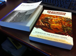
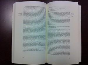
The (sub-)edition that inspired me to finally compose this post. These books are reminiscent of my favorite sort of programming references.
Wow, a new form factor! The cover design has even more inviting, lightly-colored space than the 4th Edition. And there’s something so pleasant about the feel of a compact, slightly-heavy, handheld paperback book. It feels like it wants to get thrown in your bag and become battered by years of happy use, rather than stacked up and lugged around by hand like a grade-school textbook.
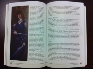
It took about three decades, but they arrived at a format that puts a digestible amount of information on each page. One column, legible text with plenty of breathing room, and just a couple of levels of clean heading styles. Especially cool is the way the subheadings flow right into their text. The branding chrome is almost nonexistent: a little fantasy flair around the page numbers, and the rest of the page is dedicated to words that explain the dang game to you.
That’s how it should be — this is a game that takes place inside language and imagination. I am impressed at and grateful for the amount of respect these more recent books show for the player.
Comparison Specimens
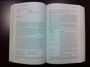
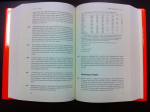
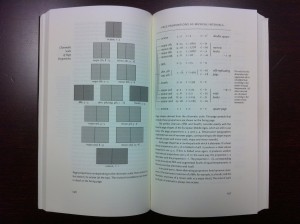
Here are a few of my favorite nonfiction book designs. It’s remarkable how well the Essentials books match the handbook approach of these fine documents.
Python Essential Reference
The Chicago Manual of Style, 15th Edition
The Elements of Typographic Style
