Unexpected UI Shouldn’t Respond to Input So Fast
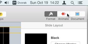
October 19, 2014Working on slides for my talk, with a Keynote window filling most of my screen. I go to hit the Animate button, in order to set up a transition.

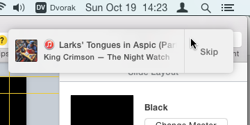
Just as I am commiting to clicking the button, the album I’m listening to moves on to the next song, and an iTunes notification appears. The big Skip button is positioned right under the mouse pointer.

My feeble human brain can’t interpret the intrusion in time, and continues clicking. Of course, the song is skipped and my flow is shot. Not only is the train of thought about my work interrupted, but so is the music that was keeping me going. (It happened to be an awesome live lead-in from one song to the next, not just an ordinary track boundary.)
Whenever something like this happens, I have to wonder why the UI element happily accepted my input immediately after appearing on the screen. It took me somewhere on the order of 2 seconds to acquire the click target. Then the unexpected UI element appeared. I didn’t summon it by my previous input; the system decided to put it up because it wanted to tell me something. Then, without moving the cursor, I clicked.
No human could be expected to see the new element, make a decision about it, and then click it, all within the 200 milliseconds or so after it appeared. It seems that this sort of accidental input could be avoided by using a few heuristics, based on research about human reaction times:
-
A UI element presented by the system without having just been specifically summoned by the user (“unexpected UI”) should not respond to input until a sufficient amount of time has passed that it’s reasonable to believe that the user has seen it and made a decision based on it.
-
Unexpected UI shouldn’t respond to input as quickly if the cursor hasn’t moved since before the UI appeared. (Because in that case, the cursor was probably moved there in order to click on whatever used to be there.)
-
Unexpected UI that wants to appear under the cursor should wait a moment (perhaps until a click happens), or possibly appear shifted away from where the cursor is, especially if the cursor just traveled a significant distance to get there.
This could also help avoid the (ancient) problem where you’re typing away in some app when suddenly an alert appears in front of your work and eats your keystrokes. Boom, you’ve just hit OK on some dialog you didn’t even have time to read. What did it say? Nobody knows. Imagine if the system cared that you were in the middle of a long string of typing, and didn’t bother you until it was clear you were pausing for a moment. The way computers think they can just throw junk in front of you at any moment, regardless of what you’re doing, has always struck me as terribly presumptuous.
Note that the way I wish we’d treat unexpected UI is the opposite of my usual complaint that UI elements don’t respond fast enough, like iOS 7 and 8’s frustrating tendency to make you wait until an animation is finished before you can carry on with what you are trying to do. Like, say, trying to swipe between home screen pages while the unlock animation is still going. That’s because I think there’s a huge difference between how we should treat something the user summoned versus something the system summoned.
This probably seems like a tiny thing. And it’s not that exciting to talk about, because it’s avoiding an error rather than creating a fun experience. But I think it’s these usually-invisible micro-interactions that differentiate a solid, reliable-feeling experience from one that feels old and computery and dumb.
I filed this issue with Apple as Radar #18755630, which I have heard from Apple folks is helpful to share.