Unison 2 Color & Contrast
January 6, 2010Panic continues to make me grumble in envy at their tasteful, forward-looking app design. Today they released Unison 2, and as is their way, they give a nichey niche product a nicer treatment than most mainstream ones get.
There are a lot of custom touches to admire: the spread-out 3D look of the Welcome message. The new green cutaway trial notice, much more, uh, noticeable than the old one. The lightweight column headers. The whimsical, iTunesy topic “cover art”.
But I found some places in the app’s use of color and contrast where I would have made different choices. In the interest of working out some thoughts I’ve been having about contrast in our own apps lately, I’ll take Unison as a neutral object for criticism.
I’ve nothing but respect for Cabel & everyone else at Panic, and I’m certain they are not making these decisions willy-nilly. This is intended not as a polemic but as an analysis of where the app differs from my own appreach to designing a harmonious presentation. Check it out:
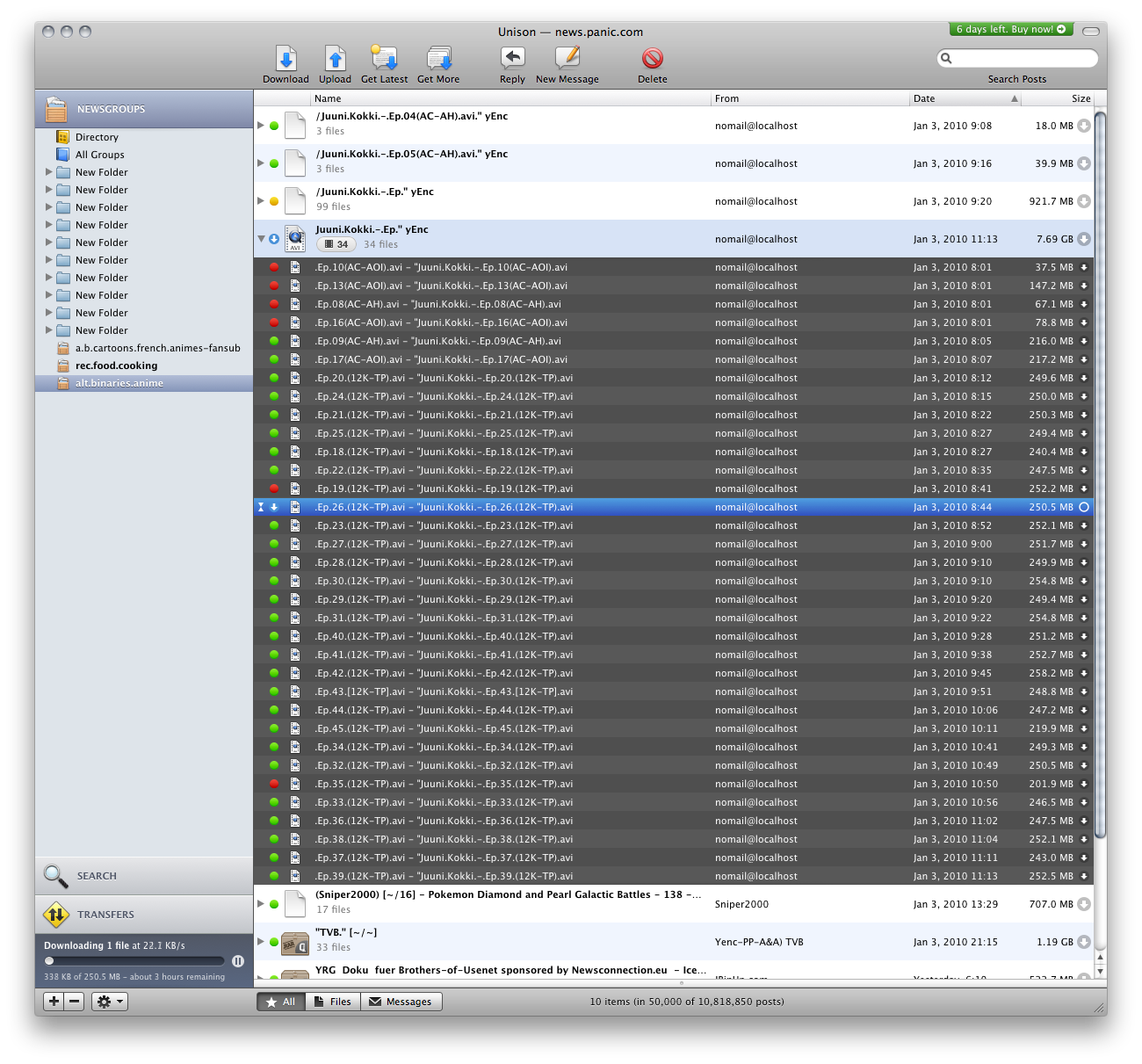
The first thing to demand your attention is the swath of dark gray listing the individual files of an archive. I think this is meant to suggest that you’ve split the rows of the table apart and are peeking at nitty-gritty details. But the effect is that the deepest hierarchical level gets the most intense visual treatment: very large, very dark, and surrounded by lightness.
Instead, the smaller icons and a bit of indentation would have been plenty. Mac users seem not to have a problem with two-level outlines of dark content on a light background, right? Or perhaps, for better distinction, the bottom pane (unused and collapsed here) could list the contents of the selected archive, like in Mail.
Next heaviest is the lower-left transfer progress area. Its dark, rather blue-saturated background makes it the heaviest thing in the sidebar — much more substantial than the light gray bar that contains it.
I don’t think the unique dark color serves this area any better than the ordinary light blue sidebar content color would have. If you want to have an obvious indication that downloading is in progress, another distinct but light treatment could work well.
 There are a lot of these grayish bluish gradienty or inner-shadowy areas around the interface, each one slightly different; their purpose and relationships get confusing.
Okay, color. There seem to be four things selected in the screenshot:
- the Newsgroups sidebar container in gradienty grayish blue,
- the alt.binaries.anime sidebar item in almost the same gradienty grayish blue,
- the Juuni Kokki archive in flat light blue,
- and the individual AVI file in intense gradienty blue.
In Mac apps, I expect there to be one selection indicator with any color saturation at all: the one with keyboard focus. Other selections ought to be desaturated. Parents of selected items don’t need to appear selected at all. Also, I appreciate the distinction between gradient sidebar source list highlights and flat content area highlights.
I would want the selected file to appear in some flat variant of my system highlight color (purple, of course), and the a.b.a sidebar source item in gradienty gray.
iTunes is a pretty good precedent as an app for browsing abundant online libraries for something to download. Check it out:
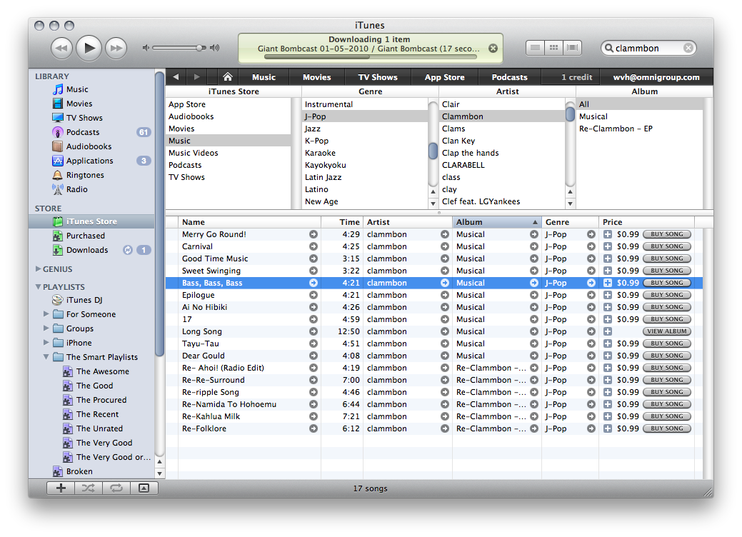
The medium-gray top and bottom bars of administrative chrome encapsulate the lighter inner areas of content. The black store navigation bar is darker, though, in order to be substantial enough to anchor and contain all of the contents below it.
The LCD-lookin' display at the top reports what the app is up to at the moment — similar to Unison’s download progress area. Apparently I’m downloading the latest Bombcast. That Game Boy light greenish-yellow isn’t just nostalgic and charming. It establishes a recognizable area that you can immediately locate when you are interested, without being distractingly heavier than the chrome around it.
And of course, the highlight colors are tidy. Gradient for sidebar items, flat for content items; colored for focused, gray for unfocused. Minus ten thousand points for ignoring my system highlight color, though!